- What is Logo Design, and Why Illustrator for Small Businesses?
- Why a Strategic Logo Design Process Matters for Small Businesses
- How It Works: Essential Logo Design Steps in Illustrator
- Real-Life Use Case: Designing a Logo for a Local Coffee Shop in Illustrator
- Comparison: Illustrator vs. Other Logo Design Tools
- Common Mistakes to Avoid in the Logo Design Process for Small Businesses
- Expert Tips and Best Practices for Small Business Logo Design in Illustrator
- FAQ Section
- Conclusion
What is Logo Design, and Why Illustrator for Small Businesses?
Why Adobe Illustrator is Ideal for Small Business Logo Design in 2025:
- Vector-Based Precision: Illustrator is a vector graphics editor, meaning it creates artwork using mathematical equations rather than pixels. This is crucial for logos because vector graphics are infinitely scalable without losing quality or becoming pixelated. Your logo will look crisp on a business card, a billboard, or a website.
- Industry Standard: Illustrator is the go-to tool for professional logo designers worldwide. Learning it ensures you’re using a robust, feature-rich program that produces industry-standard file types (.ai, .eps, .svg) compatible with printers, web designers, and other professionals.
- Typography Control: Logos often rely heavily on text. Illustrator offers unparalleled control over typography, allowing you to manipulate fonts, create custom typefaces, and integrate text seamlessly into your design.
- Powerful Shape Tools: From basic geometric shapes to complex custom forms, Illustrator provides a comprehensive suite of tools (Pen Tool, Shape Builder Tool, Pathfinder) to create unique and precise vector artwork.
- Color Management: Accurate color reproduction is vital for branding. Illustrator provides advanced color management features, including CMYK for print and RGB/Hex for web, ensuring consistency across all applications.
- Integration with Other Adobe Apps: If your small business also uses Photoshop for images or InDesign for brochures, Illustrator’s seamless integration streamlines your overall design workflow.

Why a Strategic Logo Design Process Matters for Small Businesses
A strategic logo design process for small businesses Illustrator isn’t just about creating a pretty picture; it’s about building a recognizable, trustworthy, and impactful brand. Here’s why this methodical approach is crucial:
- First Impressions are Lasting: Your logo is often the first visual interaction a potential customer has with your business. A professional, well-designed logo instantly conveys credibility and attention to detail.
- Brand Recognition and Memorability: A unique and consistent logo helps customers quickly identify your business across various touchpoints, from social media to storefronts. Memorability leads to repeat business.
- Differentiates You from Competitors: In a crowded marketplace, a distinctive logo helps your small business stand out. It communicates what makes you unique and why customers should choose you.
- Conveys Your Brand’s Story and Values: Through its colors, typography, shapes, and imagery, a logo can subtly (or overtly) tell your brand’s story, values, and personality without uttering a single word.
- Builds Trust and Loyalty: A professional logo suggests stability and reliability. Over time, consistent use builds customer trust and fosters brand loyalty.
- Versatility Across Media: A logo designed with a strategic process and in vector format ensures it can be used effectively everywhere—from a tiny app icon to a large banner, maintaining clarity and impact. For tips on managing complex projects, check out our guide on Agile Scrum Certification Tips for Beginners, which highlights structured methodologies.
How It Works: Essential Logo Design Steps in Illustrator
The logo design process for small businesses Illustrator involves several distinct stages, each crucial for developing a strong and effective visual identity. Here’s a detailed breakdown of the key logo design steps:
1. Discovery & Research (Understanding the Core)
This foundational stage is often overlooked but is the most critical. You can’t design effectively without understanding your subject.
- Understand the Business: What does the small business do? What are its core products/services? What is its unique selling proposition (USP)?
- Define the Target Audience: Who are the ideal customers? What are their demographics, preferences, and values?
- Identify Brand Personality: Is the brand modern, traditional, playful, serious, luxurious, affordable? Use adjectives to describe its desired feel.
- Competitor Analysis: Research competitor logos. What works, what doesn’t? How can your logo stand out? Avoid accidental similarities.
- Keyword Brainstorming: List keywords associated with the business, its industry, and its values. These can inspire visual concepts.
2. Brainstorming & Sketching (Ideas on Paper)
Before touching Illustrator, get your ideas flowing on paper. Sketching is fast, flexible, and encourages raw creativity.
- Mind Mapping: Start with your keywords and branch out with related concepts, images, and feelings.
- Thumbnail Sketches: Rapidly sketch dozens, even hundreds, of small logo ideas. Don’t worry about perfection; focus on quantity and variety. Explore different icon types (wordmarks, lettermarks, pictorial marks, abstract marks, mascots, emblems).
- Visual Metaphors: Think about how to visually represent abstract concepts or combine two ideas into one symbol.
- Simplicity Focus: Aim for simple, recognizable shapes that work well at small sizes.
3. Vectorization in Illustrator (Bringing it to Digital Life)
Now, translate your best sketches into scalable vector graphics in Adobe Illustrator.
- Import Sketch: Place your chosen sketch onto an Illustrator artboard as a template layer (File > Place). Lock this layer.
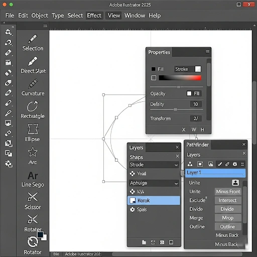
- Use Basic Shapes: Start by building your logo from fundamental shapes (rectangles, circles, polygons) and then combine or subtract them using the **Pathfinder panel** or **Shape Builder Tool**. This ensures clean, geometric precision.
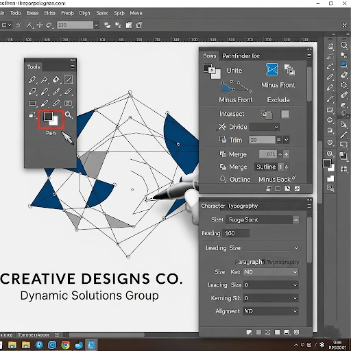
- Pen Tool Mastery: For custom curves and intricate shapes, the **Pen Tool** is indispensable. Practice its use to draw smooth, precise vector paths.
- Refine Paths & Anchor Points: Use the **Direct Selection Tool** (A) to adjust individual anchor points and curve handles for perfect symmetry and flow.
- Color Exploration: Experiment with different color palettes. Consider color psychology and what feelings each color evokes. Create a separate color palette swatch for consistency.
- Typography Selection & Customization:
- Choose a font that matches the brand personality.
- Adjust kerning (spacing between letters) and leading (line spacing) for readability.
- Consider outlining your text (`Type > Create Outlines`) once satisfied, especially for final delivery, to ensure consistency across all systems.

4. Refinement & Iteration (Polishing the Diamond)
This stage involves finessing your designs and creating variations.
- Grids and Guides: Use Illustrator’s grid system and Smart Guides to ensure precise alignment and consistent spacing.
- Size and Scale Testing: Test how the logo looks at various sizes—tiny (e.g., favicon) to large (e.g., banner). Does it remain legible and impactful?
- Color Variations: Create monochrome (black and white), single-color, and inverse color versions of your logo to ensure versatility.
- Contextual Mockups: Place your logo on mockups of real-world applications (e.g., business cards, website headers, t-shirts) to see how it performs in context.
5. Presentation & Feedback (Seeking Insights)
Present your best concepts and gather constructive feedback.
- Present 2-3 Strong Concepts: Don’t overwhelm with too many options. Present your strongest, most distinct logo concepts.
- Explain Your Rationale: Articulate the thinking behind each design, tying it back to the research and brand strategy.
- Collect Specific Feedback: Ask targeted questions. Avoid vague “do you like it?” questions. Focus on whether it meets the initial goals and resonates with the target audience.
6. Finalization & Delivery (The Finished Product)
Once feedback is incorporated and a logo is approved, prepare the final files.
- Clean Up Files: Ensure all layers are well-organized, unnecessary elements are removed, and paths are clean.
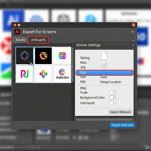
- Export Various Formats: Provide the logo in all necessary formats:
- **Vector Formats:** .AI (for original editing), .EPS (for print/professional use), .SVG (for web, scalable)
- **Raster Formats:** .PNG (with transparent background, for web), .JPG (for general use)
- Create a Simple Brand Guideline (Optional but Recommended): A small document detailing logo usage, color codes (CMYK, RGB, Hex), and approved fonts ensures consistent branding for the small business.

Real-Life Use Case: Designing a Logo for a Local Coffee Shop in Illustrator
Discovery & Sketching:
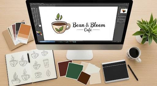
I researched local coffee shop logos – many used coffee beans or mugs. I wanted something more unique. My mind map branched from “coffee” to “steam,” “cozy nook,” “sunrise,” “community hub.” I sketched dozens of ideas: coffee cups with steam forming a stylized initial, a friendly coffee bean character, a rising sun integrated with a coffee cup silhouette. The most promising concept combined a steaming coffee cup with a subtly integrated book or a circular, sun-like element.
Vectorization in Illustrator:
I brought my best sketch into Illustrator. Using the **Ellipse Tool** and **Pathfinder panel**, I created the basic cup shape. The steam was tricky; I used the **Pen Tool** to draw elegant, swirling lines, then adjusted the strokes’ thickness and applied a slight taper. For the sun/book element, I used another circle and added simple lines for rays or a subtle book spine shape, ensuring it fit within the cup’s steam. The typeface was crucial. I experimented with various serif and sans-serif fonts, ultimately choosing a slightly distressed, friendly sans-serif that conveyed “rustic and inviting.” I then outlined the text. Colors were warm browns, creams, and a soft orange for the steam/sun, reflecting the “warm” and “sunrise” themes.
Refinement & Presentation:
I created monochrome versions and a reversed (light on dark) version. I placed the logo on mockups of a coffee cup sleeve, a wooden sign, and a website header. Presenting these mockups, along with my rationale for the colors and shapes, helped the owner visualize the logo in action. The feedback was positive, with a minor request to make the steam slightly more prominent.
Finalization:
After adjusting the steam, I cleaned up all paths, ensuring no stray anchor points. I exported the final logo in .AI, .EPS, and .SVG for scalable vector use, and transparent .PNGs for web and print applications. I also created a small PDF showing the logo in different colorways and usage guidelines for the coffee shop.
Comparison: Illustrator vs. Other Logo Design Tools
While Illustrator is the professional standard, it’s helpful for small businesses to understand other options for logo creation, especially if budget or technical skill is a major factor.
| Feature / Tool | Adobe Illustrator | Canva | Adobe Photoshop | Affinity Designer |
|---|---|---|---|---|
| Type | Vector Graphics Editor | Online Graphic Design Tool | Raster Graphics Editor | Vector & Raster (Hybrid) |
| Learning Curve | Moderate to High | Very Low | Moderate to High | Moderate |
| Scalability for Logos | Infinite (Vector) – Ideal | Limited (Often Raster, template-based) | Limited (Raster) – Not ideal for logos | Infinite (Vector) – Ideal |
| Control & Customization | Full, pixel-perfect control over every element | Template-based, limited customization | Good for pixel-based art, less precise for crisp logos | Full control, robust vector tools |
| Price Model | Subscription (Adobe Creative Cloud) | Freemium (Basic free, Pro subscription) | Subscription (Adobe Creative Cloud) | One-time purchase |
| Pros |
|
|
|
|
| Cons |
|
|
|
|
Common Mistakes to Avoid in the Logo Design Process for Small Businesses
Even experienced designers can make mistakes, and for small businesses embarking on their logo journey, it’s easy to fall into common traps. Avoiding these pitfalls will significantly improve your logo design process for small businesses Illustrator, resulting in a more effective brand mark:
- Over-complication: A busy logo with too many elements, fonts, or colors becomes difficult to read, recall, and reproduce across different platforms. Simplicity is key for memorability.
- Ignoring Scalability: Designing only at a large size without considering how the logo will look when tiny (e.g., app icon, social media avatar) is a huge mistake. Always test scalability.
- Chasing Trends: While modern touches are good, designing a logo based solely on fleeting trends can make it look dated very quickly. Aim for timelessness.
- Using Raster Graphics (e.g., Photoshop) for Final Logo: Logos *must* be vector-based to ensure infinite scalability without pixelation. Photoshop is for pixel-based images, not scalable logos.
- Relying on Stock Imagery or Clip Art: This makes your logo generic and legally risky. Your logo needs to be unique and original.
- Poor Typography Choices: Hard-to-read fonts, too many fonts, or poorly kerned text can ruin an otherwise good design. Typography is integral to a logo’s success.
- Lack of Versatility: A good logo works equally well in color, black and white, and on various backgrounds. If it relies solely on color to convey its message, it’s not versatile enough.
- Not Researching Competitors: Failing to analyze competitor logos can lead to designs that are too similar, causing confusion or making your brand appear unoriginal.
- Skipping the Sketching Phase: Jumping straight into Illustrator often limits creativity and exploration. Paper and pencil allow for rapid iteration and idea generation without digital constraints.
Expert Tips and Best Practices for Small Business Logo Design in Illustrator
To truly excel in the logo design process for small businesses Illustrator provides, integrate these expert tips into your workflow:
- Embrace the Golden Ratio/Rule of Thirds: While not a strict rule, using these principles as guides can help create visually harmonious and balanced logos.
- Sketch, Sketch, Sketch: Before opening Illustrator, fill pages with rapid thumbnail sketches. Explore dozens of concepts to ensure you’ve exhausted initial ideas and found truly unique solutions.
- Focus on the Negative Space: Sometimes, the space *around* elements in your logo can form a secondary, meaningful image. Train your eye to see these hidden shapes (e.g., the arrow in the FedEx logo).
- Think in Black and White First: Design your logo in black and white before introducing color. If it doesn’t work monochromatically, color won’t save it. This ensures strong contrast and form.
- Use Grids and Guides Religiously: For ultimate precision and clean lines in Illustrator, set up custom grids (`View > Show Grid`, `View > Snap to Grid`) and utilize Smart Guides (`View > Smart Guides`) to align elements perfectly.
- Master the Pathfinder and Shape Builder Tools: These are Illustrator’s superpowers for creating complex vector shapes from simpler ones. Learn their functions (Unite, Minus Front, Intersect, Divide) for efficient and clean design.
- Get Objective Feedback: Share your logo concepts with people outside your immediate circle (potential customers, business advisors) and ask specific, constructive questions. Be open to criticism.
- Study Iconic Logos: Analyze why famous logos work. What makes them memorable, versatile, and timeless? Deconstruct their simplicity, use of symbolism, and typography.
- Create a “Clear Space” Zone: Design a buffer area around your logo that must remain free of other graphics or text. This ensures its visual impact is maintained regardless of placement.
- Save Versions Iteratively: As you refine, save new versions of your Illustrator file (e.g., Logo_V1.ai, Logo_V2.ai). This allows you to revert to previous stages if needed.

FAQ Section
Here are some frequently asked questions about the logo design process for small businesses Illustrator users often encounter:
Q: Why can’t I just design my logo in Photoshop?
A: Photoshop is a raster-based program, meaning it works with pixels. Logos created in Photoshop will pixelate when scaled up. Illustrator, being vector-based, creates graphics using mathematical paths, allowing them to be scaled infinitely without any loss of quality, which is essential for a professional logo.
Q: How long does the logo design process typically take for a small business?
A: A professional logo design process, from research to final delivery, can take anywhere from 2-6 weeks, depending on the complexity of the design, the number of revisions, and the responsiveness of the client. Rushing the process often compromises quality.
Q: What’s the most important thing to consider when choosing colors for my logo?
A: Beyond personal preference, consider color psychology (what emotions do colors evoke?), your target audience, and your industry. Ensure the colors work well in different contexts (print, web, black and white) and align with your brand personality.
Q: Should my logo include an icon and text, or just one?
A: It depends on your brand. Logos can be wordmarks (text only, like Google), lettermarks (initials only, like IBM), pictorial marks (icon only, like Apple), abstract marks (stylized symbol, like Nike swoosh), mascots, or emblem logos. Many small businesses benefit from a combination mark (icon + text) that can be separated for versatility.
Q: How do I ensure my logo is unique and doesn’t look like a competitor’s?
A: Thorough competitive research in the discovery phase is crucial. Avoid generic imagery directly related to your industry. Focus on conceptual metaphors, abstract forms, or unique typography. Legal trademark searches are also recommended before finalization.
Q: What are the essential file formats I need for my logo?
A: You’ll need vector formats (.AI, .EPS, .SVG) for scalability and print, and raster formats (.PNG with transparency, .JPG) for web use and general purposes. Always get a transparent PNG for versatile placement on any background.
Q: Can I design a logo on my iPad using Illustrator?
A: Yes, Adobe Illustrator is available for iPad and offers a powerful, touch-friendly vector design experience, especially when paired with an Apple Pencil. This allows for increased flexibility in the logo design process for small businesses Illustrator offers.
Conclusion
Remember, your logo is more than just an image; it’s a promise to your customers and a statement about who you are. Invest the time to get it right, and it will serve as a powerful asset for years to come. Continue building your digital toolkit by exploring resources on secure SaaS tools, which can further enhance your business operations and branding efforts.
To continue your journey into cloud security, consider the in-depth resources from the Cloud Security Alliance (CSA), a leading authority on cloud best practices. For more hands-on guides, check out our other posts on building a secure digital toolkit.
